
A simple photography blog, by a simple twenty year old . . .
Thursday, April 14, 2011
Concert Photography
Since I've been taking pictures at my work during the summers, I wanted to learn more about how to take good concert pictures. Therefore I read this article with 9 Tips on How to Get The Shot at a concert. First of all Nyani Quarmyne talks about getting the exposure right, since stage light can be very tricky and differs from stage to stage, it is important to not just have one setting but to figure out what settings works best for each place. Your settings should also differ depending on how many people are on the stage, thus depending on what depth of field you want. Another tip is to make a shortcut to your histogram viewing on your camera, that way you can take a quick look while you're shooting to make sure you don't over exposure or under exposure the images. However, do not check all of the photos, while doing that you are missing out what is happening on stage. The third point that Nyani talks about is to watch the performers, learn their way of moving and what is typical for just that artist, in that way you can be prepared beforehand and set up your composition before a certain movement occurs so it's easier to capture it. In his fifth, sixth, and seventh point he talks about being aware of the composition, it is not only the performer that is important in the image, also to make sure that everything around him/her works good in the image. Watch for clutter in the back- and foreground so you don't have anything that takes unnecessary attention from the singer. Last but not least important, be nice, don't forget that other people are there and have paid a lot of money to be able to watch their favorite band or singer, and as Nyani points out, if you're being nice, you often also get helped to be able to stand at a certain place and take those picture from the angle you really want. Also, show your appreciation to the artist!

Tuesday, April 12, 2011
Sunset lightning
Sunset light is a beautiful light while taking portraits (even though everyone has its own opinion), however, to be able to use the light to its fullest capacity it's important to know some basic "rules" of how the light works. To give me some help with this I read this article How to Use Sunset Light to Light Portraits. Christina N Dickson talks about three different lights, Front Light, Side Light, and Back Light.
Front light is when your subject is facing the light and you as the photographer has your back toward the light. "The light will brightly illuminate your subject, bringing out stunning catchlights." A problem that can occur with this light is that it can make your models pupils to small, if that happens you can ask your model to close his/her eyes and open them right before you snap the shot.
Side Light, you get side light when you ask your model to turn so that only one shoulder is facing the light and then turning their face 3/4 degrees into the light. This will give you "soft transfer edges between the highlight and shadows". It will also add depth to your portrait.
Back Light is when the sun is behind the model and you are in front of the model. This could give you really good silhouette but you can also overexpose the portrait so the model is evenly lit, this will cause the background to be overexposed and the highlight will be blown out, but it gives the picture a cool effect, and by decreasing the saturation level would make it stand out as an image eve more, but that's just my opinion.
Since I'm not a professional photographer I have not yet learn to appreciate the use of flashes (since I do not have the right equipment) however, I still like to take pictures without using any flash or strobes, but one thing that I think would be good to have is a reflector, this will eliminate the worse shadows that I usually get in my photos.Portrait Lightning
This photo is taken up at the rims, the only source is coming from the sun. The model, Jackie is placed with her body towards the sun and her left side of her face too. This is why her left cheek is really bright and her right side is more dark, this also creates an ugly shadow from her nose. The sun light most have reflected on the rocks since the back of her hair is lightened and you can still see her whole face. I don't feel that it's necessary with a strobe for this picture, but I would really liked to have a reflector.

Friday, April 1, 2011
Portrait Photography
I decided to search for some tips on portrait photography, in order to get some inspirations for our portrait shoot that is coming up. Once again I found two articles at the Digital Photography School's website. 10 Ways to Take Stunning Portraits and 10 More Tips for Stunning Portraits. It is two articles that guides you to take portraits that have that 'wow' factor. First of all, learn the rules of portrait photography, second of all, break them! That is basically what Darren Rowse is talking about. Throughout both the articles he gives 20 examples of composition, lightning, angles, sharpness, blur, framing and several other things. His consistent emphasis in the articles is to be creative and experimental but still be prepared and ready to go (and know what to do) before your model arrives. In every example that Rowse gives, he uses pictures which make it more fun to read through and easier to understand. These two articles are really worth to check out!
Here are some old portrait photos that I've taken.


Here are some old portrait photos that I've taken.


But below is the kind of portrait photos that I want to be able to take!
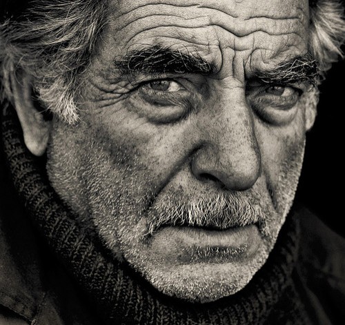 |
| Yuri Melnikov |
 |
| Julia Wilam |
 |
| Magda Berny |
Wednesday, March 30, 2011
Action/Adventure
The third theme in class has been action/adventure photography, so here are my contributions.
Settings:
The settings for the image below is: Shutter speed 1/1000 sec. f/5.60, ISO 200. I adjusted the colors, made the sky more blue, blurred out the background a little bit and cloned out some annoying trees,the logo on his jacket and some other small unimportant stuff.

1/1000 sec, f/8, ISO 400

Shutter Speed 1/1000, f/8, ISO 400

Shutter Speed 1/250 sec, f/22, ISO 800

Shutter Speed 1/250, f/6.30, ISO 100

Shutter Speed 1/250, f/20, ISO 800

Black & White
"Black and white photography has a way of letting the viewer really experience the image. Composition, light/shadow, texture and tonal qualities all become more obvious and important when color is absent." - Bill Jones
Since I really like black & white photographs I decided to read an article about the Key Ingredients for Black and White Images. This article is a summary of a longer article in Digital Camera Magazine (UK). Darren Rowse is talking about the key points that was in that article and also his own thoughts about it. When taking black and white image you can't use the color to distinguish every element, therefore, the tonal variance is much more important. Before taking the picture one should look for the contrast between the colors, however, as Rowse points out, there is no need to look for stark contrast for every image you're taking and planning to convert to black and white. Another important point to this is that in Photoshop, we can convert each color separately, and make the contrast between each color bigger or less, how ever we want it. Linked to the contrast is light, when you have the "right" light you also get the best amount of contrast in the picture and between the colors. For example, if you have direct lightning, it will often add to contrast. Side lightening reveals any texture that the subject may have and with that create shadows. As with any kind of image, shadows and light can be either amazing or distracting, therefore "play with light with care". One thing that can be unseen in a color picture (due to the color drawing attention itself) but really comes alive in black & white images are shapes and patterns.
Darren Rowse also give a tip while taking black and white landscape photos. Simply, look for "active skies", this adds so much more life and 'action' to the picture.
I also looked up some black and white photographs and found this website with 60 inspiring Examples of Black & White Photography. Below is three of them that I like.
 |
| Sally Mann |
 |
| MisterKey |
 |
| Ronald Koster |
Sunday, March 27, 2011
Color
For this week I've read an article in four parts about "Composing with Color". Alain Briot talks about how important it is for a photographer to be able to "see in color". Even though most people can see in color, it is important to be able to know what colors would look good in a photograph and how it will appear when taking the picture. The most important to know when it comes to color is the three variables of color.. "Controlling color, in photography, is controlling the three variables of color" (Briot, Part 1) These three variable is Hue (Nyans), Saturation (Mättnad), and Brighteness. The image in Briot's article that explains this the best is an image of Munsell's Color System. Albert H. Munsell, an American painter and professor in art, wanted to create a "rational way to describe color" that, instead of using color names (which Munsell felt was "foolish" and "misleading"), he would use decimal notation. Which would make it easier for him to describe colors for his students.

Throughout this article, Briot uses several qoutes from famous artist. Their common thoughts is that black & white photographs and color photographs is two really different subjects, however, they also work a lot together. To take a great black & white pictures, you have to now a lot about how the different hues (colors) reacts on desaturation. They also see how important color is as compostion, I think they all would agree that color is more than just color. "The difficulty with color is to go beyond the fact that it is color – to have it be not just a colorful picture but really be a picture about something. It's difficult. So often color gets caught up in color, and it becomes merely decorative. Some photographers use it brilliantly to make visual statements combining color and content; otherwise it is empty." - (Mary Ellen Mark)
Mary Ellen Mark was born in suburban Philadelphia, Pennsylvania, 1940. She started to take pictures at the age of 9, at that time with a Bow Brownie camera. She has been working over 30 years persuing her passion for photography, and been voted Most Influential Woman Photographer of All Time by the readers of American Photo. Her focus in photography has addressed such social issues as homelessness, loneliness, drug addiction, and prostitution. She primarly works in black & white. Mark's subjects is always people, where ever she goes it is the people that makes the photos and each picture and person tell their own story. Many of these whom she gotten to know in intimate detail. "Her knowledge guides the story but does not interfere with her demand for the strongest photograph." (Article about Mark)
 |
| Mary Ellen Mark |
 |
| Mary Ellen Mark |
Following is a few of the other qoutes that Briot use in his article, these are all worthy to think about.
"The prejudice many photographers have against colour photography comes from not thinking of colour as form. You can say things with colour that can’t be said in black and white… Those who say that colour will eventually replace black and white are talking nonsense. The two do not compete with each other. They are different means to different ends." - Edward Weston
In my photography, color and composition are inseparable. I see in color. - William Albert Allard
It is not the form that dictates the color, but the color that brings out the form. - Hans Hofman
To see in color is a delight for the eye but to see in black and white is a delight for the soul. - Andri Cauldwell
Overall, the article about composing with color talks about the three different variables of color and how to use these to make a good and professional image, how to be better at understanding color, and how it is affected by light, "Color is an important element of composition, one that you need to consider carefully when you are creating color photographs. Color is a powerful element and judicious use of color can significantly improve your compositions, as we learned with the examples above. It is therefore important to learn not only how color works, but also how to change the color of the elements in your composition." (Briot, Part 4)
You can find the whole article with all the four parts here:
Part 1
Part 2
Part 3
Part 4
You can find the whole article with all the four parts here:
Part 1
Part 2
Part 3
Part 4
Subscribe to:
Posts (Atom)