Wednesday, March 30, 2011

Action/Adventure

The third theme in class has been action/adventure photography, so here are my contributions. 

Settings:

The settings for the image below is: Shutter speed 1/1000 sec. f/5.60, ISO 200. I adjusted the colors, made the sky more blue, blurred out the background a little bit and cloned out some annoying trees,the logo on his jacket and some other small unimportant stuff.


1/1000 sec, f/8, ISO 400 

Shutter Speed 1/1000, f/8, ISO 400

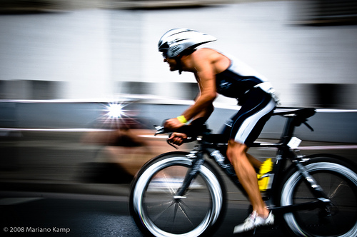
Shutter Speed 1/250 sec, f/22, ISO 800

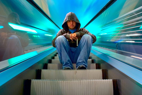
Shutter Speed 1/250, f/6.30, ISO 100

Shutter Speed 1/250, f/20, ISO 800

Black & White

               "Black and white photography has a way of letting the viewer really experience the image. Composition, light/shadow, texture and tonal qualities all become more obvious and important when color is absent." - Bill Jones  


                Since I really like black & white photographs I decided to read an article about the Key Ingredients for Black and White Images. This article is a summary of a longer article in Digital Camera Magazine (UK). Darren Rowse is talking about the key points that was in that article and also his own thoughts about it. When taking black and white image you can't use the color to distinguish every element, therefore, the tonal variance is much more important. Before taking the picture one should look for the contrast between the colors, however, as Rowse points out, there is no need to look for stark contrast for every image you're taking and planning to convert to black and white. Another important point to this is that in Photoshop, we can convert each color separately, and make the contrast between each color bigger or less, how ever we want it. Linked to the contrast is light, when you have the "right" light you also get the best amount of contrast in the picture and between the colors. For example, if you have direct lightning, it will often add to contrast. Side lightening reveals any texture that the subject may have and with that create shadows. As with any kind of image, shadows and light can be either amazing or distracting, therefore "play with light with care". One thing that can be unseen in a color picture (due to the color drawing attention itself) but really comes alive in black & white images are shapes and patterns. 


Darren Rowse also give a tip while taking black and white landscape photos. Simply, look for "active skies", this adds so much more life and 'action' to the picture.


I also looked up some black and white photographs and found this website with 60 inspiring Examples of Black & White Photography. Below is three of them that I like. 


Sally Mann

MisterKey

Ronald Koster

Sunday, March 27, 2011

Color

For this week I've read an article in four parts about "Composing with Color". Alain Briot talks about how important it is for a photographer to be able to "see in color". Even though most people can see in color, it is important to be able to know what colors would look good in a photograph and how it will appear when taking the picture. The most important to know when it comes to color is the three variables of color.. "Controlling color, in photography, is controlling the three variables of color" (Briot, Part 1) These three variable is Hue (Nyans), Saturation (Mättnad), and Brighteness. The image in Briot's article that explains this the best is an image of Munsell's Color System. Albert H. Munsell, an American painter and professor in art, wanted to create a "rational way to describe color" that, instead of using color names (which Munsell felt was "foolish" and "misleading"), he would use decimal notation. Which would make it easier for him to describe colors for his students.

I think that this image of Munsell's Color System describes the three variables of colors the best. Hue is all the different colors, Saturation is how intense each individual color is. "Saturation goes from total desaturation (grayscale) to full saturation (maximum color intensity)." Brightness or Lightness is how dark of light the color is.


Throughout this article, Briot uses several qoutes from famous artist. Their common thoughts is that black & white photographs and color photographs is two really different subjects, however, they also work a lot together. To take a great black & white pictures, you have to now a lot about how the different hues (colors) reacts on desaturation. They also see how important color is as compostion, I think they all would agree that color is more than just color. "The difficulty with color is to go beyond the fact that it is color – to have it be not just a colorful picture but really be a picture about something. It's difficult. So often color gets caught up in color, and it becomes merely decorative. Some photographers use it brilliantly to make visual statements combining color and content; otherwise it is empty." - (Mary Ellen Mark)


                  Mary Ellen Mark was born in suburban Philadelphia, Pennsylvania, 1940. She started to take pictures at the age of 9, at that time with a Bow Brownie camera. She has been working over 30 years persuing her passion for photography, and been voted Most Influential Woman Photographer of All Time by the readers of American Photo. Her focus in photography has addressed such social issues as homelessness, loneliness, drug addiction, and prostitution. She primarly works in black & white. Mark's subjects is always people, where ever she goes it is the people that makes the photos and each picture and person tell their own story. Many of these whom she gotten to know in intimate detail. "Her knowledge guides the story but does not interfere with her demand for the strongest photograph." (Article about Mark)

Mary Ellen Mark
   

Mary Ellen Mark

 In Briot's article he talks about how photographers that is working in black and white "make a significant effort towards developing an awareness of black and white tones." The black and white photographers need to know how each color will appear in a black and white convertion and which shades of grey these colors are becoming. Another important thing is to know which areas of the image will be the darkest and the lightest. Prior to taking a picture a black and white photografer wants to visualize the image as black and white. One way to learn how different brightness areas will translate into shades of grey is to use a black and white viewing filter.


Following is a few of the other qoutes that Briot use in his article, these are all worthy to think about.

"The prejudice many photographers have against colour photography comes from not thinking of colour as form. You can say things with colour that can’t be said in black and white… Those who say that colour will eventually replace black and white are talking nonsense. The two do not compete with each other. They are different means to different ends." - Edward Weston

In my photography, color and composition are inseparable. I see in color. - William Albert Allard


It is not the form that dictates the color, but the color that brings out the form. - Hans Hofman

To see in color is a delight for the eye but to see in black and white is a delight for the soul. - Andri Cauldwell 

Overall, the article about composing with color talks about the three different variables of color and how to use these to make a good and professional image, how to be better at understanding color, and how it is affected by light, "Color is an important element of composition, one that you need to consider carefully when you are creating color photographs. Color is a powerful element and judicious use of color can significantly improve your compositions, as we learned with the examples above. It is therefore important to learn not only how color works, but also how to change the color of the elements in your composition." (Briot, Part 4)


You can find the whole article with all the four parts here:
Part 1
Part 2
Part 3
Part 4


Wednesday, March 23, 2011

RW Pike

               For this weeks blog I found the website/blog of Rodney Pike, or more known as RWPike. He distorts images in a caricature-istic way, not only is his images caricatures of famous people but they also appears photorealisitic and so detailed, that if you didn't know better you could think that this is how the people actually looks like. As he says in his introduction of himself, "My work is a bit different than your average photo manipulator." He does all kinds of photo manipulations but his focus right now is political satire and caricature illustration. "I specialize in photo-manipulated caricatured illustrations perfect for magazines, books, posters etc" For his work he uses Photoshop CS2 without any extras.

I think that his work is really well done and fun to look at. Here is some examples from his works but if you want to see more, check out his photo gallery

George Wein, Rodney Pike

"Napoleon Dynamite", Rodney Pike

Rolling Stones, Rodney Pike

Woody Allen, Rodney Pike
                

Wednesday, March 16, 2011

"Photography, etymologically speaking, means writing with light"


                       As the water is essential for a swimmer, the light is the most important for a photographer, it's as simple as, no light, no picture. As a professional photographer you become more aware of the light sources and how to use it with it's full potential. I have read four articles about composing with light. In the first one, Composing with light, Part 1 , Alain Briot brings up several good points of how to work with light when you are offered different types of natural light sources. It points out several times that light is what is most important when we are photographing, "For a photographer the quality of the light is the one thing that can never be ignored. It is everything." light is what we have to adjust after and thinking of first, before deciding where to put the object in the picture. Light is basically what we first have to consider while composing a picture. In this article they claim that "light is composition". However, a great picture requires great light, and with the best light you'll get the best photograph. But even if you do have perfect light, you still need to be able to include object and elements in your composition. Finding the best light for your personal style is "both a matter of personal experience and knowledge and a matter of using the right tools." In the matter of experience, a photographer is going to notice that the light that we usually prefer is not always the best light for a photo session. The bad weather can actually be the best weather. "Bad weather is a tremendous help in our quest to find good light." A tip is to not stay in the house or your hotel room a rainy, cloudy or stormy day, wait until the storm is over, then go outside and capture the amazing sky. In some other pictures, it is the light that creates the composition. 


              To get the right light is also to know when and where the sun is going to be and where it should be so you can get a great picture out of it. There is many application's to help you knowing where and when you can get the best sunlight. In part 2 of this article Briot talks about just that. For example you can use a compass, the old farmers almanac, a gps, Focalware (iPhone app), or a downloadable full-fledged astronomical software Equinox 6. In this article you can find several links to websites that offers features of where sunrise and sunset will appear at what time. However, there is so much more than just learning about the sun, since the sky also include "clouds, haze lightning, rain, rainbows, snow and snowstorms, reflections, sun stars, star trails, halos, light shafts, rims of light, comets and other astronomical events as well as a myriad of other lighting conditions." After reading this section and by looking at the pictures it struck me how different a photograph appears with different natural light sources, an image of the same object with the camera at the same exact spot at different times of the day differs a lot. Something boring can all of a sudden become really amazing in the photo if the light is right and vice versa. With help from light you can also find various things to make the image better, example of that is reflection in water, silhouettes, and different patterns shaped from shade. 


           This article helps you understand more about light and how you can best use the natural light sources. In Part 3 and 4 you can find the pictures where Briot shows similar pictures with different light sources, as I said before, it's really cool to see the differences. When he compared places from sunrise to dusk or to sunset I think that I like the ones taken at dusk better. The light is much softer and nothing in the picture really stands out as a distraction from the sun brightening up parts in the landscape as in the pictures taken at sunset. However, the pictures taking in at sunrise gives an effect that makes the light look warmer and cooler (more cool). I have never really felt like getting up at dawn to take pictures, but after reading this article it makes me wanna explore the light more and even set my alarm clock at a time that is otherwise far too early..


Composing with light article:


Wednesday, March 9, 2011

Motion Blur in Photography

For this week I read this article,  Tips & Tricks for Motion blur Photography. It is about how you can use the feature of the camera that is usually just annoying - the blur in pictures - and make it to amazing photographs.


There is seven things that this article brings up:
         Charge your reflects
         Know your surroundings
         Use shutter speed priority mode
         Following the subject
         Use panning image stabilization
         Using lower ISO
         Try to keep yourself steady


So what you need to keep in mind is; be alert and prepared with your camera before your subject is gone. Be aware of your background so you don't get to much distraction in your image. To help you capture sharp subjects, follow your subject throughout the subjects motion. As an image stabilization, use panning mode, which exists in most digital cameras. Hold the camera still to prevent unwanted motion in the picture.


A simple article but with good "reminding"-points. Under are two example of motion blur photographs.


Mariano Kamp
Designzzz.com